Have you ever noticed that the color of furniture, clothing, or tiles looked completely different in the store than it did at home? Or that food lost its natural color under certain lighting and didn’t look as good as it should? In most cases, the problem isn’t with the materials or colors themselves, but with the quality of the light illuminating them.
It is precisely a light source’s ability to accurately render colors that is described by the CRI (Color Rendering Index) parameter, also known as the color rendering index. Although this is one of the most important factors when selecting lighting, many people focus primarily on lighting lighting design, output, or color temperature when making a purchase.
In practice, however, the difference between standard lighting with a low CRI and high-quality light with a high color rendering index is surprisingly significant. This is most evident in kitchens, bathrooms, dressing rooms, restaurants, or anywhere where the natural appearance of colors, materials, and details matters.
In this article, we’ll explain exactly what CRI means, how it affects the appearance of interiors and individual materials, what the difference is between CRI 80, CRI 90, and CRI 95, and when it’s worth investing in lighting with better color rendering.

Article content
- What is CRI, and what does the Color Rendering Index mean?
- Why is CRI important when choosing lighting?
- CRI 80 vs. CRI 90 vs. CRI 95: What’s the difference?
- Where are high-CRI lighting worth it?
- How do you determine the CRI value of lighting?
- Common mistakes when choosing lighting
- FAQ: Frequently Asked Questions About CRI
What is CRI, and what does the Color Rendering Index mean?
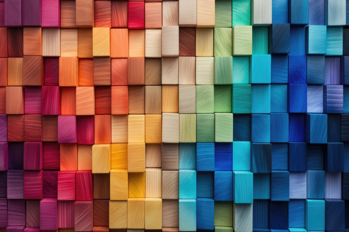
CRI (Color Rendering Index) is a measure that indicates how accurately a light source will render colors. In other words, it determines whether materials, furniture, food, or clothing will appear natural under artificial lighting, or whether their hues will be distorted.
We encounter this parameter quite often when selecting lighting for kitchens, bathrooms, or restaurants. While many people focus primarily on lighting lighting output or light temperature, CRI is often one of the reasons why two light sources that appear similar at first glance create a completely different overall impression.
Imagine, for example, fresh fruit, a well-cooked steak, or a wooden countertop. Under high-quality lighting, the colors will appear vivid and natural. However, if the light source has a low CRI, the same objects may appear dull, grayish, or lacking the necessary depth. This is most noticeable precisely where the appearance of colors really matters.

The CRI value ranges from 0 to 100. The higher the number a light source has, the more accurately it reproduces true colors. Today, modern, high-quality LED lighting commonly achieve CRI values of 90 or higher, which is the level we recommend for most residential interiors as well as prestigious commercial spaces.
When comparing two similar light fixtures, the difference in the final appearance of the space is often due to the CRI value. A higher color rendering index is most noticeable in kitchens, bathrooms, dressing rooms, or restaurants, where the natural appearance of materials, food, and skin matters.
Why is CRI important when choosing lighting?
Unlike light output or color temperature, most people hardly pay attention to CRI values when choosing lighting. Yet it is precisely this parameter that often determines whether the interior will look natural and visually pleasing once the project is complete.
We often encounter situations where a customer invests in high-quality materials, furniture, and decor, but after installing the lighting, feels that the space doesn’t look as good as it does in daylight. The reason for this may not be light itself, but rather poor color rendering.
Where is the difference in CRI most noticeable?
The difference is most noticeable in rooms where the appearance of materials, colors, or details matters:
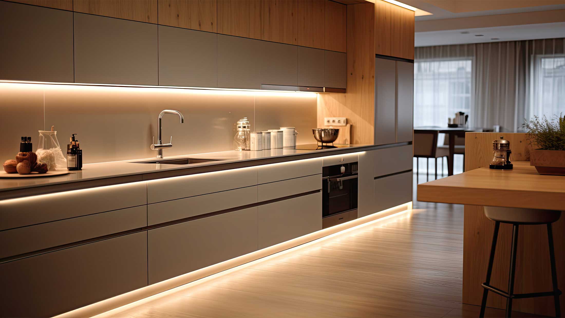
- Kitchens – countertops, food, and colorful accessories look more vibrant and natural
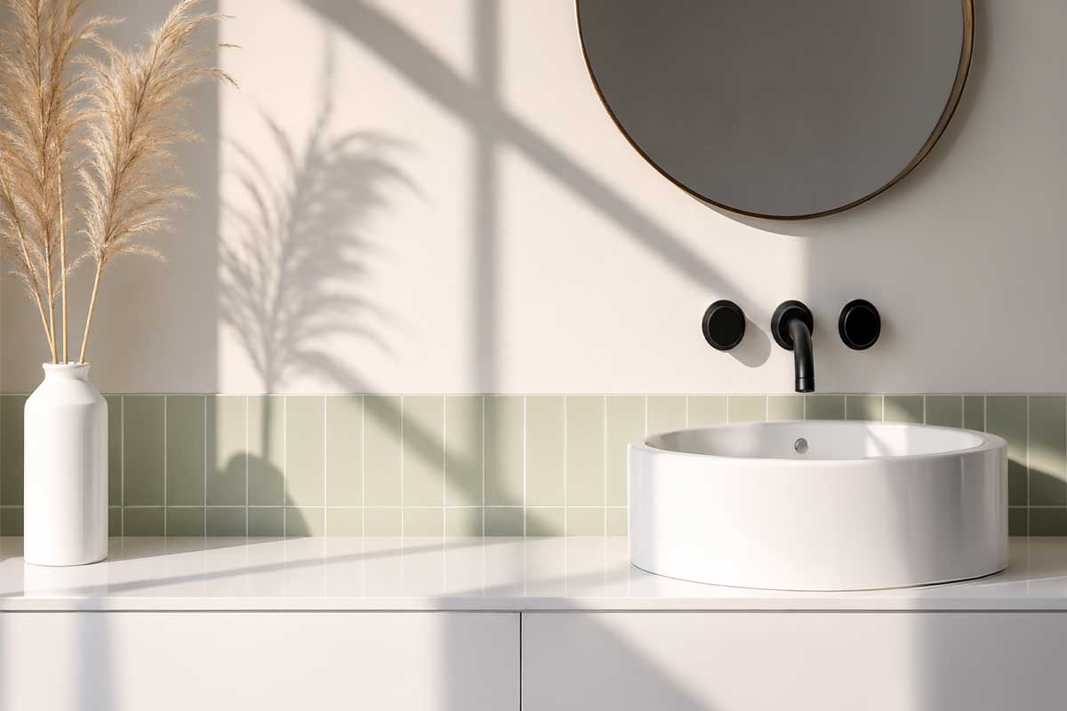
- Bathrooms and dressing rooms – more accurate rendering of skin tones, clothing, and makeup
- Living rooms – better highlighting of wood textures, fabrics, and decorations
- Restaurants and cafes – food and drinks look more appealing and fresher
The difference between standard lighting and a light source with a high CRI is often much more pronounced than people expect. This is most noticeable in the evening, when artificial lighting takes on the leading role in the entire interior.
If you are selecting lighting for a residential interior, we recommend choosing a CRI of at least 90. A higher color rendering index is most noticeable in kitchens, bathrooms, closets, and anywhere else where you spend a lot of time under artificial lighting.

In our experience, CRI is one of the parameters that customers often overlook before making a purchase. However, once they have the opportunity to compare two similar lighting side by side, the difference in the appearance of the space is immediately apparent.
CRI 80 vs. CRI 90 vs. CRI 95: What’s the difference?
One of the most common questions when choosing lighting is whether it’s worth paying extra for a higher CRI. The difference between the various levels may not always be apparent at first glance, but in certain situations, it can significantly affect the final appearance of the space and the colors displayed.
| CRI value | Color rendering quality | Typical applications |
|---|---|---|
| CRI 80 | Good | Hallways, utility rooms, general lighting |
| CRI 90 | Very good | Kitchens, bathrooms, living rooms, restaurants |
| CRI 95+ | Excellent | Galleries, showrooms, designer interiors, photography |

For most modern households, we recommend choosing lighting with a CRI of at least 90. The price difference compared to standard light sources is relatively small these days, while the difference in the appearance of materials, food, or skin can be very noticeable during everyday use.
Where are high-CRI lighting worth it?
Not every space requires the highest possible CRI values. In a utility room, storage closet, or hallway, you often won’t even notice the difference. However, there are places where high-quality color rendering significantly affects both everyday comfort and the overall appearance of the interior.
We spend a lot of time in the kitchen preparing meals and working with various materials. High-quality color rendering helps accurately display food, countertops, tiles, and other interior elements. The difference is particularly noticeable with natural materials such as wood or stone.
When applying makeup, shaving, or choosing clothes, it’s important to see colors as naturally as possible. Light sources with a higher CRI help better display the shade of your skin, hair, and individual clothing colors.
In the restaurant industry, the appearance of food plays an important role. High-quality lighting can highlight the natural colors of food, beverages, and interior materials, contributing to a better overall experience for guests.
Customers expect to see products in their true colors. A higher CRI helps accurately display clothing, furniture, decorations, and other products, and reduces the risk of color distortion.
In environments where art, photography, or graphic design are involved, a high CRI is a fundamental requirement. Accurate color rendering ensures the correct perception of details and individual shades.
How do you determine the CRI value of lighting?
If you’re interested in color rendering quality, you don’t need to look up complicated technical standards or take your own measurements. Reputable manufacturers list the CRI value directly in the technical specifications lighting or light source.
When selecting lighting, we recommend paying attention not only to the CRI value itself, but also to where the manufacturer lists it and how detailed the technical specifications are.
What CRI values are common?
- CRI or Ra ≥ 80 – basic color rendering suitable for hallways, utility rooms, or general lighting.
- CRI or Ra ≥ 90 – the recommended value for most modern homes, kitchens, bathrooms, restaurants, and high-end interiors.
- CRI or Ra ≥ 95 – very high color rendering quality used in galleries, showrooms, photography, and design projects.
Where can you find the CRI value?
- Manufacturer's technical data sheet – the most reliable source of information on the actual technical specifications lighting or light source.
- Product page – high-quality manufacturers and retailers typically list the CRI value among the basic lighting parameters.
- Catalog or project documentation – for professional lighting fixtures, the color rendering index is typically included in the complete technical specifications.
- LED light source specifications – for replaceable LED bulbs, the CRI value is usually listed directly on the packaging or in the product details.
You may also come across the term Ra. In common practice, this is the same rating as CRI, and the two terms are often used interchangeably.
If a manufacturer does not specify the CRI at all, this is often a red flag. For high-quality lighting fixtures and light sources, information on color rendering is typically included among the standard technical specifications.
Common mistakes when choosing lighting from a CRI perspective
CRI is one of the parameters most often overlooked when selecting lighting. In practice, we regularly encounter several errors that can significantly affect the final look of the interior and the perception of colors.
Higher light output does not automatically mean better lighting. If a light source has a low CRI, materials and colors may appear dull regardless of the amount of light.
Light temperature 3000K or 4000K determines the character of the lighting, but on its own, it does not guarantee accurate color reproduction. When designing lighting, we recommend also considering CRI, visual comfort, and glare levels. We explain more in the article What is UGR and why is it important when choosing lighting? .
If a manufacturer does not specify the CRI value at all, it is advisable to be cautious. For high-quality lighting fixtures, the color rendering index is typically included in the technical documentation.
Using lighting fixtures with different CRI values can cause parts of the interior to appear color-unbalanced and less natural. These differences are also often clearly visible with LED strips. When designing, we therefore recommend considering the proper layering of lighting in the interior, which significantly affects the atmosphere of the space and the perception of colors.
Not every part of an interior requires the same color rendering quality. You’ll especially appreciate a higher CRI in the kitchen, bathroom, dressing room, or above the dining table.

The good news is that most of these mistakes can be easily avoided. When making your selection, simply pay attention not only to lighting lighting design, output, and color temperature, but also to its color rendering quality.
Conclusion
CRI is one of the technical parameters that has a greater impact on the final look of an interior than most people realize when choosing lighting. It is precisely the quality of color rendering that determines whether materials, furniture, food, or decorations will appear natural and match how they look in daylight.
The difference between standard lighting and fixtures with a higher CRI is most noticeable in kitchens, bathrooms, closets, or anywhere where accurate color and detail perception matters. In a well-designed interior, high-quality color rendering often makes a bigger difference than the lighting output itself. We explore this topic further in the article “Common Mistakes in Lighting Design.”
If we were to recommend one thing, it’s worth noting that when choosing lighting, you shouldn’t focus solely on the lighting design, light output, or color temperature. CRI is just as important, as it significantly affects the overall atmosphere of the space and how natural the interior will feel during everyday use. You can also find more about comprehensive interior lighting design in our step-by-step guide on how to properly design lighting for your home.
Frequently Asked Questions About CRI and Color Rendering
What does CRI mean in lighting?
CRI (Color Rendering Index) indicates how accurately a light source renders colors compared to natural daylight. The higher the CRI value, the more natural materials, furniture, food, or clothing appear under the lighting.
What CRI is suitable for the home?
For most modern homes, we recommend lighting with a CRI of at least 90. The higher color rendering quality is particularly noticeable in kitchens, bathrooms, living rooms, and closets.
Is a CRI of 80 sufficient?
CRI 80 represents a basic level of color rendering that may be sufficient for hallways, utility rooms, or less demanding spaces. In residential interiors, however, the difference compared to CRI 90 is often noticeable.
What is the difference between CRI 80 and CRI 90?
Lighting with a CRI of 90 render colors significantly more accurately and naturally than standard lighting with a CRI of 80. The difference is particularly noticeable in items such as wood, textiles, skin tones, food, and colorful decorations.
How do you determine the CRI value of lighting?
The CRI value is typically listed in the manufacturer’s technical data sheet, on the product page, or in the specifications of the LED light source. You may also come across the designation Ra, which refers to the same color rendering rating.
Why is a high CRI important in the kitchen or bathroom?
In the kitchen and bathroom, accurate color and detail perception plays an important role. A higher CRI helps to render food, work surfaces, skin, and materials more naturally, which enhances comfort during everyday use of the space.
Does a higher CRI affect energy consumption?
A higher CRI does not necessarily mean significantly higher energy consumption. Today, modern, high-quality LED lighting are capable of combining a high CRI, low energy consumption, and a long service life.
Is CRI important for LED lighting as well?
Yes. With LED lighting in particular, differences in color rendering quality can be very significant. Two LED lighting with the same color temperature can produce a completely different final look in an interior precisely because of their different CRI values.
Choose lighting with high-quality color rendering
Proper lighting affects not only the amount of light, but also how naturally materials, colors, and the overall atmosphere of the space will appear. Browse our selection of designer lighting fixtures featuring high-quality LED lighting and a high CRI.
Browse interior lighting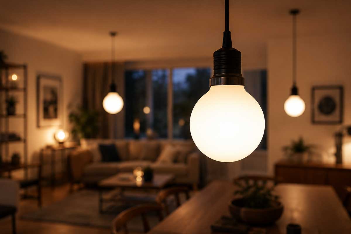
Share:
How to install LED strips? A complete step-by-step guide
Bathroom Lighting: A Blend of Functionality and Design