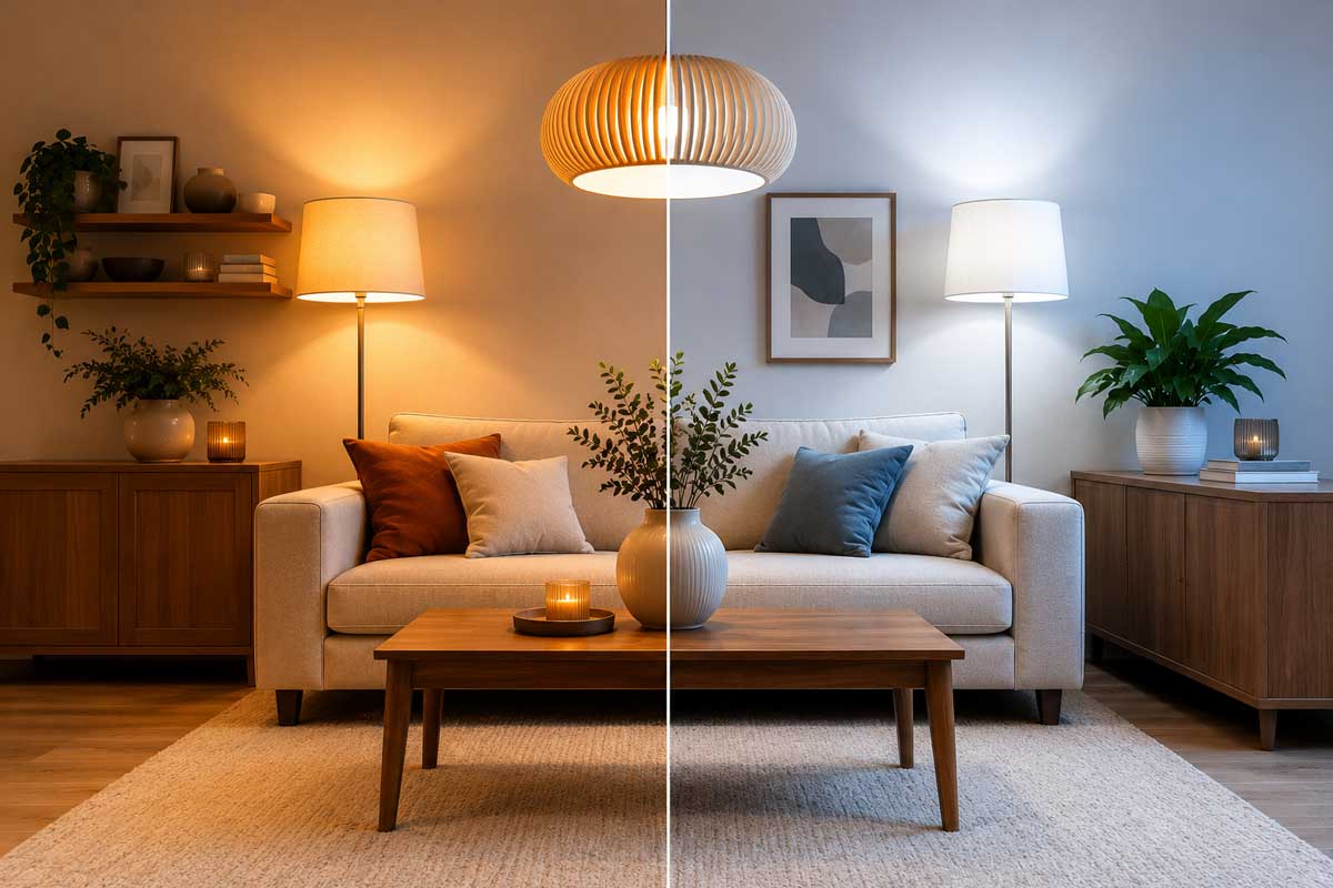
Have you chosen the perfect shade of white, beige, or gray, but after installing the lighting, it looks completely different than you expected? You’re not alone. Lighting is one of the most common reasons why colors in an interior look different than they do in a color chart or showroom.
Light temperature, light intensity, color rendering index (CRI), and the placement of the fixtures all influence how walls, furniture, floors, and decorations will actually look. The same color can take on a golden hue under warm light, while under cooler lighting it appears significantly cooler or grayer.
In this article, we’ll explore how lighting affects color perception, why light temperature and CRI are important, and how to choose lighting so that colors in your interior look natural and match your vision.

Article content
- Why lighting affects color perception
- How light temperature affects colors in interiors
- How light intensity affects the appearance of colors
- How CRI affects color rendering
- What CRI to choose for individual rooms
- How the direction of light changes the appearance of colors
- How different colors react to warm and cool light
- How to choose lighting for accurate color rendering
- FAQ: Frequently asked questions about lighting and colors in interiors
- The same color can look significantly different under different lighting conditions.
- Light temperature affects whether colors appear warmer, more neutral, or cooler.
- Light intensity affects the saturation, contrast, and overall character of colors.
- High CRI helps maintain natural and accurate color rendering.
- The direction of light influences the perception of textures, materials, and architectural details.
- For most modern interiors, we recommend a CRI of 90+ and a carefully selected color temperature.
Why lighting affects color perception
Many people choose the colors of their walls, furniture, or decorations based on a color chart in daylight, but the resulting impression in the interior is often surprisingly different once the lighting is installed. The reason is simple—we don’t perceive color in isolation, but always in conjunction with the light that falls on it.
The same shade can appear fresh and natural in the morning, take on a golden hue under warm lighting in the evening, and appear grayer or less distinct under cooler light. That is why lighting is one of the most important elements in interior design.
In our experience, the greatest differences are usually noticeable with neutral colors, such as white, beige, gray, or greige shades. It is precisely these colors that an improperly chosen light temperature can alter more than most people expect.
- Light temperature affects the color tone of the illuminated space.
- Light intensity affects the perception of color saturation and contrast.
- The Color Rendering Index (CRI) determines how accurately colors will be rendered.
- The direction of light either highlights or, conversely, suppresses textures and surface details.
If you want the colors in your interior to match your vision, it’s not enough to simply choose the shade of your paint or furniture. It’s just as important to select the right lighting that will enhance their character and not distort them visually.
How light temperature affects colors in interiors
Color temperature is one of the most important parameters of lighting. It is measured in kelvins (K) and determines whether the light will appear warm, neutral, or cool. This parameter has a significant impact on how individual colors will appear in a space.
If you're not sure about the difference between warm, neutral, and cool light, we also recommend the article "What is CCT and How to Choose the Right Light Temperature."
In practice, we often see that while a customer may choose the right shade of furniture or paint, an inappropriate light temperature can alter the overall impression of the interior. That is why we recommend always selecting lighting in consideration of the materials used and the color palette of the space.
Warm light (2700–3000 K)
Warm white light contains more yellow and orange tones. As a result, it highlights warm shades such as beige, sand, brown, terracotta, gold, or wood in natural tones.
The interior feels cozier, softer, and more relaxing. That is precisely why warm light is most often used in living rooms, bedrooms, or hotel interiors.
If the interior is decorated in beige, cream, or natural tones, warm light is usually the safest choice. Materials appear more natural, and the space takes on a more pleasant atmosphere.
Neutral light (3500–4000 K)
Neutral white light most closely resembles natural daylight. It provides balanced color rendering without significantly warming or cooling the space.
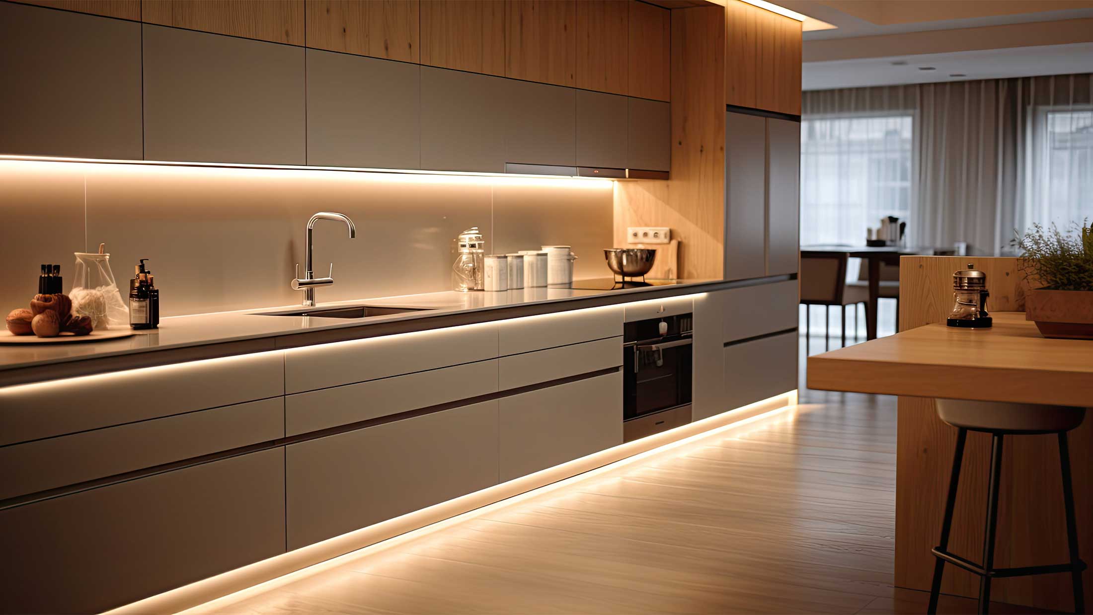
That is why it is often used in kitchens, home offices, offices, or bathrooms, where accurate color perception is essential.
Cooler light (4000–5000 K)
Cooler light accentuates white, gray, and blue tones and creates a clean, technical, and modern look. It is often used in commercial spaces, technical rooms, or wherever maximum visibility is a priority.
However, it should be used with caution in residential interiors. When combined with warm materials, the space may feel less cozy, and some colors may lose their natural depth.
How light intensity affects the appearance of colors
When discussing the effect of lighting on colors, most attention is focused on light temperature. However, light intensity is just as important. It is the amount of light falling on surfaces that determines how rich, contrasting, and vivid individual colors will appear.
The same shade can appear vibrant and energetic in a well-lit room, while at lower light intensities it takes on a softer and more subdued character. That is why it is important to consider not only the color of the light but also its sufficient output when designing lighting.
Light output is most commonly measured in lumens. If you’re wondering how much light individual rooms or work areas need, be sure to read our article “What Are Lumens and How Many Do You Need for Each Room?”

Higher light intensity
With sufficient lighting, colors appear more vivid and true to life. Differences between individual shades stand out more clearly, the texture of materials is highlighted, and the entire space takes on a fresher and more dynamic character.
That is why higher light intensity is often used in kitchens, home offices, bathrooms, or commercial spaces where good visibility and precise perception of details are important.
Lower light intensity
Softer or dimmer lighting, on the other hand, creates a softer atmosphere. Colors may appear deeper, calmer, and less contrasting. However, some shades may lose their original richness, and the details of materials may not be as clearly visible.
This effect is often desired in living rooms, bedrooms, restaurants, or hotel interiors, where the goal is to create a pleasant and relaxing atmosphere.
If you want to maintain the natural appearance of colors both during the day and in the evening, we recommend combining main lighting with supplementary lighting scenes. Thanks to dimming or multiple lighting circuits, you can adjust the light intensity to suit the current situation without negatively affecting color perception.
To achieve a natural look in an interior, it is therefore important to find a balance between sufficient light intensity and the desired atmosphere of the space.
How CRI affects the appearance of colors in interiors
Light temperature and intensity influence the atmosphere of a space, but one other important parameter determines how accurately colors will actually appear—the color rendering index (CRI).
CRI indicates a light source’s ability to render colors as closely as possible to natural daylight. The higher the CRI value, the more natural and accurate the individual shades will appear in the interior.
This is precisely why two lighting with the same color temperature can create completely different visual impressions. While a high-quality light source can highlight the depth of materials and the naturalness of colors, a lower CRI can cause certain shades to appear dull, washed-out, or slightly distorted.

- on natural wood and veneers
- in beige, cream, and earthy tones
- on textiles and upholstery
- in kitchens and closets
- for paintings, decorations, and design elements
For standard living spaces, a minimum CRI of 80 is recommended. However, if you want the colors of your furniture, floors, walls, or decorations to look as natural as possible, we recommend choosing lighting with a CRI of 90 or higher.
In modern interiors, where materials, textures, and carefully selected color combinations play an important role, a high CRI is among the parameters that have a greater impact on the overall impression than most people realize.
If you're interested in learning more about this topic, we've prepared a separate guide: What is CRI and how does it affect color rendering?
What CRI to choose for individual rooms
Color rendering requirements vary depending on the type of space. While the highest CRI value may not be essential in a utility room, it can significantly affect everyday comfort in a kitchen, closet, or bathroom.
| Room | Recommended CRI |
|---|---|
| Living room | 80+ |
| Bedroom | 80+ |
| Kitchen | 90+ |
| Bathroom | 90+ |
| Locker Room | 90+ |
| Study | 80–90+ |
If you are selecting lighting for spaces where accurate color rendering is important, we recommend choosing lighting with a CRI of 90 or higher. The difference compared to the standard CRI of 80 is particularly noticeable with natural materials, textiles, skin, or food.
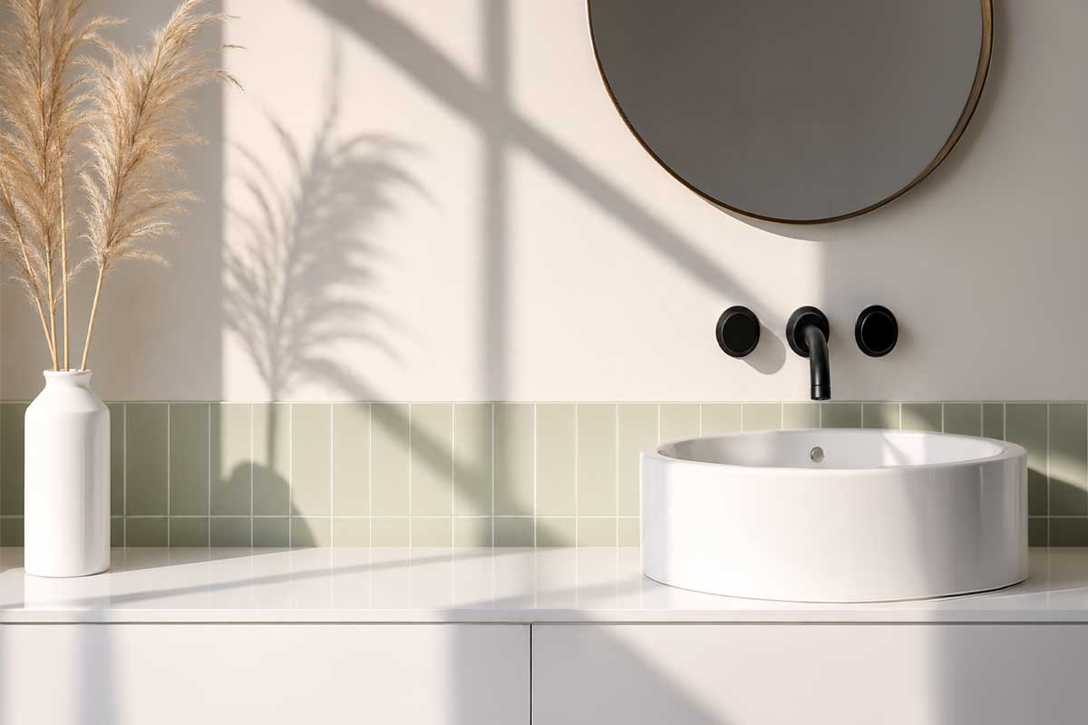
How the direction of light changes the appearance of colors
When designing lighting, factors such as light temperature, intensity, and CRI are often considered. However, the direction from which light hits a surface is equally important. It is this factor that determines how vivid colors will appear, how material textures will stand out, and the overall impression the space will make.
The same color can look completely different under different lighting. This isn’t because its shade has changed, but because of the way light creates shadows, contrasts, and reflections on the surface of the material.
Direct light highlights textures and contrasts
Directional lighting, such as spotlights or floodlights, can significantly highlight the texture of materials. Wood appears more three-dimensional, stone gains greater depth, and decorative surfaces stand out more clearly.
This effect is often used to illuminate paintings, feature walls, architectural details, or striking decorative elements.
Indirect light creates a softer look
Light reflected from the ceiling or walls appears more even and creates softer transitions between light and shadow. Colors then appear calmer, and the space takes on a harmonious character.
Indirect lighting is often used in living rooms, bedrooms, or formal interiors, where the goal is to create a pleasant atmosphere without stark contrasts.
Matte surfaces react to changes in the direction of light differently than glossy materials. While matte walls generally appear consistent, glossy surfaces can significantly change their appearance, brightness, and color impression depending on the angle of the light.
That is why, when selecting colors, we recommend evaluating materials not only under different types of light but also under different lighting conditions. It is the combination of light temperature, CRI, intensity, and direction of lighting that creates the overall impression of an interior.
How different colors react to warm and cool light
The same color can look completely different depending on the light temperature. Warm lighting accentuates certain shades and gives them a cozier feel, while neutral or cool light can highlight details, contrast, and color clarity.
That is why we recommend always considering the type of lighting that will be used most often in the room when choosing wall colors, furniture, or decorations.

| Color | Warm light (2700–3000 K) | Neutral to cool light (4000–5000 K) |
|---|---|---|
| White | It has a creamy, soft look | It has a clean and bright look |
| Gray | It produces a warmer tone | It has a more striking and modern look |
| Beige | It highlights golden and brown tones | It may appear cooler or grayer |
| Blue | It has a more subdued feel | It is richer and more distinctive |
| Green | It has a more natural and softer look | It has a fresher look |
| Red | It is warmer and more distinctive | It may appear less intense |
The biggest differences are usually noticeable with neutral shades, such as white, gray, or beige. These colors often look different in the showroom than they do at home because they are illuminated by a different type of light.
Based on our experience, we always recommend testing color samples directly in the space where they will be used. Only the combination of a specific color and specific lighting will reveal the true final look of the interior.
How to choose lighting for accurate color rendering
If you want the colors of your walls, furniture, floors, or decorations to look just as good in the evening as they do during the day, it’s not enough to consider only the design lighting or its light output. What matters is a combination of several factors that together influence the final look of the interior.
In our experience, the best results are achieved when the character of the space, the materials used, and the interior color palette are taken into account when selecting lighting.
Accurate color rendering is only one part of a high-quality lighting design. It is also important to properly combine general, task, and mood lighting. We explore this topic further in the article How to Combine Different Types of Lighting in an Interior.
For most residential interiors, we recommend a minimum CRI of 80, but ideally a CRI of 90 or higher. A higher value ensures more accurate color rendering and a more natural appearance of materials.
Warm light around 2700–3000 K highlights natural and earthy tones, while neutral white light at 3500–4000 K offers the most balanced color rendering in typical interiors.
Even a high-quality light source cannot display colors correctly if there is insufficient light in the space. Insufficient lighting often causes colors to appear dull and lose their depth.
The best results come from a combination of general, task, and mood lighting. This allows you to create a pleasant atmosphere while maintaining good color rendering throughout the space.
Color or material samples may look different under the lighting in the showroom than they do at home. Whenever possible, always evaluate shades in the conditions in which they will actually be used.
If you invest in high-quality materials, designer furniture, or carefully selected colors, it pays to give lighting the same attention. Properly designed lighting can highlight the character of an interior, while poor lighting can detract from even a very well-designed space.
Conclusion
The colors in an interior are not determined solely by the choice of paint, furniture, or decorations. Lighting plays an equally important role, as it determines how individual shades will actually look during the day and in the evening.
Light temperature affects the color tone of a space, light intensity alters the perception of saturation and contrast, a high CRI ensures accurate color rendering, and properly chosen lighting direction helps highlight materials, textures, and architectural details.
In our experience, the best results are achieved when lighting is addressed simultaneously with the selection of colors and materials. It is precisely the combination of high-quality lighting and thoughtful interior design that creates a space that feels natural, harmonious, and pleasant in everyday use.
If you want the colors in your interior to stand out exactly as intended, it pays to devote as much attention to choosing the lighting as to furnishing the space itself.

Frequently asked questions about the effect of lighting on colors
Why do colors look different in the evening than during the day?
We perceive colors based on the light that falls on them. Daylight has a different spectrum than most artificial light sources, which is why the same wall or piece of furniture can look different during the day and in the evening.
What color temperature distorts colors the least?
Neutral white light in the range of 3500–4000 K usually provides the most balanced color rendering. However, the appropriate color temperature always depends on the character of the interior and the materials used.
What CRI is suitable for the home?
For most interiors, we recommend a minimum CRI of 80. If you want the most accurate color rendering possible—for example, for high-quality furniture, art, or design elements—it’s worth choosing a CRI of 90 or higher.
Does light intensity affect the appearance of colors?
Yes. At higher light intensities, colors appear more vivid and contrasty. Conversely, in dimmer lighting, they may appear more subdued and less saturated.
Is warm or cool light better for the living room?
In living spaces, warm white light around 2700–3000 K is most commonly used, as it creates a pleasant and cozy atmosphere. However, the choice also depends on the color scheme of the interior.
Why did the color look different in the store than it did at home?
A showroom or retail store may use a different type of lighting than your interior. Different light temperatures, intensities, or CRI values can significantly alter the final appearance of the same shade.
How does lighting affect white and gray tones?
Neutral shades are often the most sensitive to changes in lighting. Warm light can give them a creamy hue, while cooler lighting often highlights gray or bluish tones.
How can I tell if lighting provides accurate color rendering?
Pay particular attention to the CRI value, appropriate color temperature, and sufficient light output. High-quality lighting should render colors naturally and without visible distortion.
Choose lighting that brings out the true colors of your interior
The right lighting can highlight materials, accentuate a room’s color scheme, and create a pleasant atmosphere. In addition to the lighting design, light temperature, luminous flux, and color rendering quality are also important.
Browse our selection of designer lighting fixtures and find a solution that suits your interior and how you use the space.
Browse lighting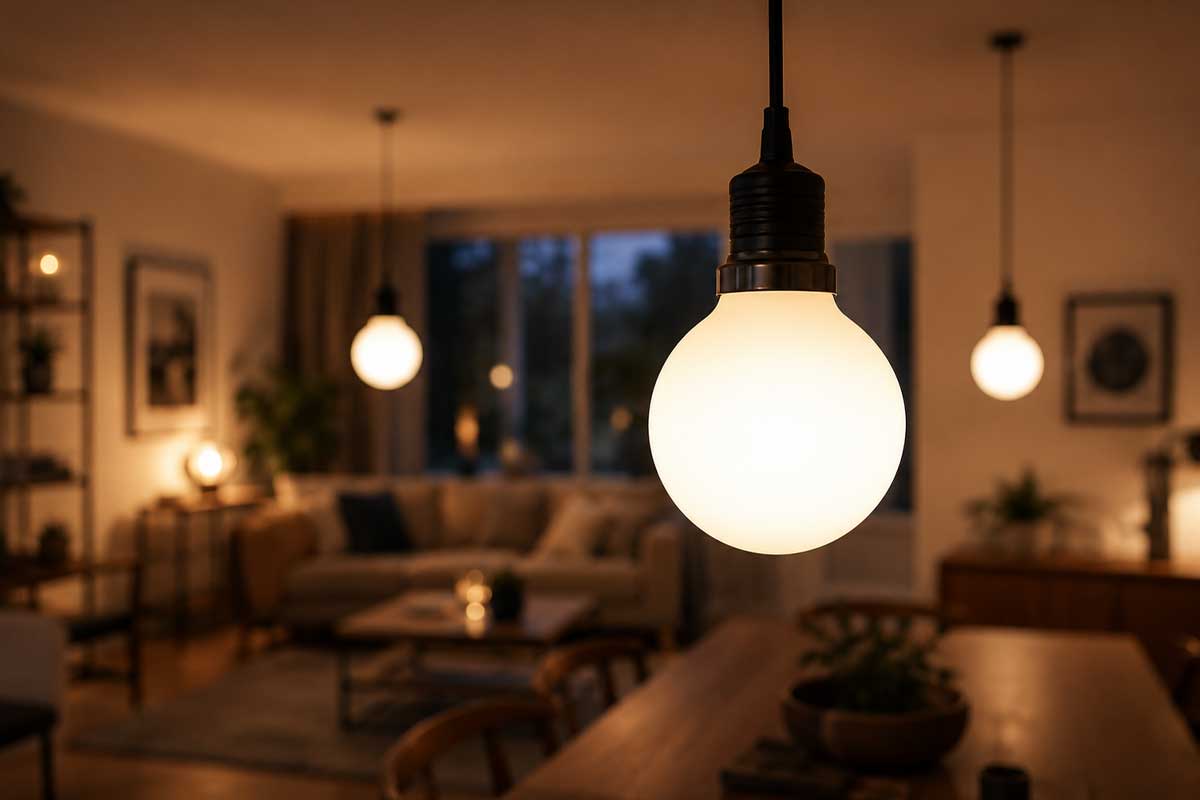
Share:
How lighting affects the atmosphere of an interior
How LED technology works